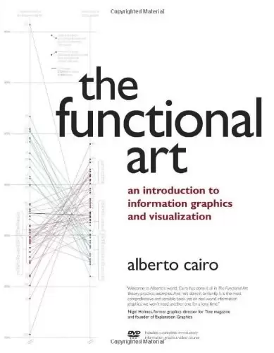
作者:AlbertoCairo
出版社:NewRiders
副标题:anintroductiontoinformationgraphicsandvisualization
出版年:2012-9-1
页数:384
定价:USD49.99
装帧:Paperback
ISBN:9780321834737
内容简介
······
Unlike any time before in our lives, we have access to vast amounts of free information. With the right tools, we can start to make sense of all this data to see patterns and trends that would otherwise be invisible to us. By transforming numbers into graphical shapes, we allow readers to understand the stories those numbers hide. In this practical introduction to understanding and using information graphics, you'll learn how to use data visualizations as tools to see beyond lists of numbers and variables and achieve new insights into the complex world around us. Regardless of the kind of data you're working with-business, science, politics, sports, or even your own personal finances-this book will show you how to use statistical charts, maps, and explanation diagrams to spot the stories in the data and learn new things from it. You'll also get to peek into the creative process of some of the world's most talented designers and visual journalists, including Conde Nast Traveler's John Grimwade, National Geographic Magazine's Fernando Baptista, The New York Times' Steve Duenes, The Washington Post's Hannah Fairfield, Hans Rosling of the Gapminder Foundation, Stanford's Geoff McGhee, and European superstars Moritz Stefaner, Jan Willem Tulp, Stefanie Posavec, and Gregor Aisch. The book also includes a DVD-ROM containing over 90 minutes of video lessons that expand on core concepts explained within the book and includes even more inspirational information graphics from the world's leading designers. The first book to offer a broad, hands-on introduction to information graphics and visualization, The Functional Art reveals: * Why data visualization should be thought of as "functional art" rather than fine art * How to use color, type, and other graphic tools to make your information graphics more effective, not just better looking * The science of how our brains perceive and remember information * Best practices for creating interactive information graphics * A comprehensive look at the creative process behind successful information graphics * An extensive gallery of inspirational work from the world's top designers and visual artists On the DVD-ROM: In this introductory video course on information graphics, Alberto Cairo goes into greater detail with even more visual examples of how to create effective information graphics that function as practical tools for aiding perception. You'll learn how to: incorporate basic design principles in your visualizations, create simple interfaces for interactive graphics, and choose the appropriate type of graphic forms for your data. Cairo also deconstructs successful information graphics from The New York Times and National Geographic magazine with sketches and images not shown in the book.
作者简介
······
Alberto Cairo is the Knight Chair in Visual Journalism at the School of Communication of the University of Miami. The author of several textbooks, he consults with companies and institutions like Google and the Congressional Budget Office on visualizations. He lives in Miami, Florida.
目录
······
Table of contents:
Part 1 – FOUNDATIONS
• Chapter 1 – Why Visualize? Information to Wisdom
• Chapter 2 – Forms and Functions: Visualization as a Technology
• Chapter 3 – The Beauty Paradox: Art and Communication
• Chapter 4 – Exposition, Exploration, and the Complexity Challenge
Part 2 – COGNITION
• Chapter 5 – The Eye and the Visual Brain
• Chapter 6 – Visualizing for the Mind
• Chapter 7 – Images in the Head
Part 3 – PRACTICE
• Chapter 8 – Creating Information Graphics
• Chapter 9 – Interactive Graphics and Visualizations
Part 4 – PROFILES
• John Grimwade (Condé Nast Traveler): The Infographics Gentleman (personal site)
• Juan Velasco and Fernando Baptista (National Geographic Magazine): Information Art
• Steve Duenes and Xaquín González (The New York Times): All the Graphics That Are Fit to Print
• Hannah Fairfield (The Washington Post): Capital Infographics
• Jan Schwochow (Golden Section Graphics): Germanic Precision
• Geoff McGhee (Stanford University , Journalism in the Age of Data): Visualization and Academia
• Hans Rosling (Gapminder): Quantitative Humanism
• Moritz Stefaner (Well-Formed Data): Truth and Beauty Operator
• Jan Willem Tulp (Tulp Interactive) and Gregor Aisch (Driven By Data): The Rising Stars
• Stefanie Posavec (It's Been Real): Visualizing Literature
评论 ······
新近出版的介绍数据可视化的最靠谱书籍 🙂
的确不感兴趣。。。感恩做研究还有自己选择的权利,不然我大概会退学
教科书的立意,最后的profile系列赞。
http://www.thefunctionalart.com/ The brain is much better at quickly detecting shade variations than shape differences. p113 light intensity > hue contrast. some features that the brain is able to det…
评论前必须登录!
注册